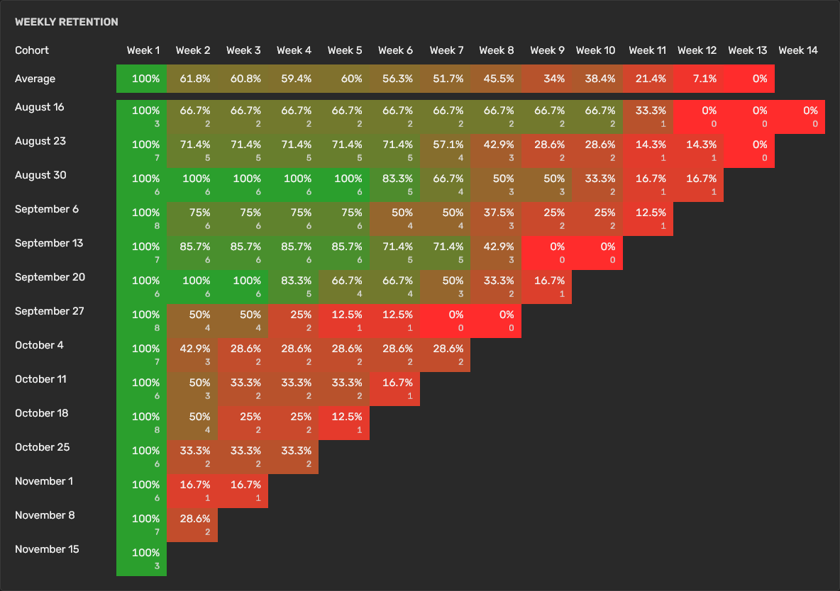
Retention Graph
The Retention Graph is a visual representation that tracks the engagement of different user cohorts over time. It allows you to monitor how well they are retaining users after their initial acquisition. Each cohort represents a group of users based on the time they started visiting your world.
Reading the Retention Graph
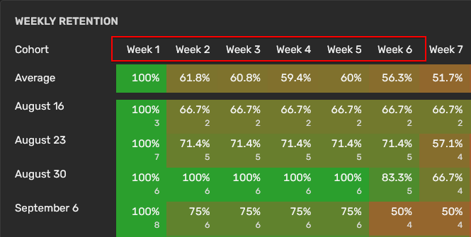
The graph is organized into rows and columns, where each row represents a cohort, and each column represents the time elapsed since the cohort's inception.
Cohorts
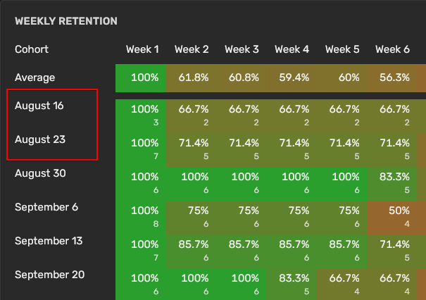
A cohort is a group of users who started visiting your world during the same time period. Cohorts are labeled by the starting date, such as "August 16", "August 23", etc.
Timeframe
The columns represent the weeks since the start of the cohort. The graph typically tracks user activity over a set number of weeks, e.g., 14 weeks.
Value
Percentage: The cell at the intersection of a cohort row and week column contains the percentage of users from the cohort who were still active at that time.
User Count: In addition to percentages, the cells may include the actual number of users remaining active from the cohort.
Color: The retention rates are often color-coded to provide a quick visual cue about the retention performance: Green indicates high retention rates, red indicates lower retention rates.
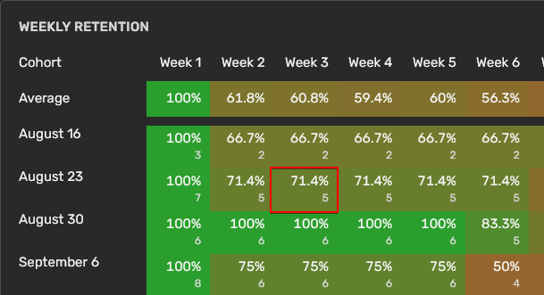
In the above: A cell under Week 3 for the "August 23" cohort shows "5", it means 5 users from that cohort were active in the third week, which is 71.4% of the 7 users who were active in the first week.